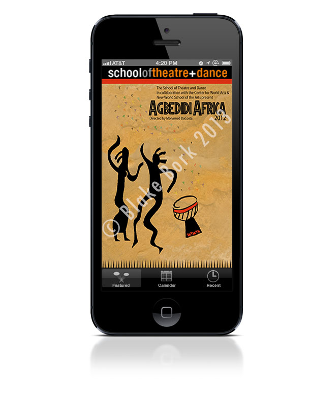
Upon opening the App, you will be greeted with the current play poster. We wanted to make sure that there was a vissible brand identiy to the App as well. So with a large header from the School of Theatre and Dance, user are able to know exactly what they are seeing.
We used a three button tab on the bottom to ensure users are overwhelmed with too many options to choose from. They can access anything in the App right from those tabbed buttons.

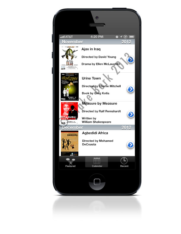
This screen was designed to take your average calendar and make it easier to view and select upcoming shows that the Theatre and Dance Department put on. It scrolls and gives a brief description of each play.
We still made all the tabbed buttons available to users to allow them to navigate to other sections of the App.

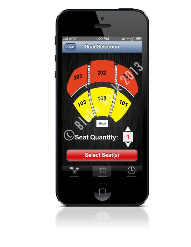
Once you have selected a play that you want to purchase tickets for, you are then able to select your seats and the quantity you want.
After you've selected your seats, you would be directed to the in-app purchase screen to finalize your order so you can be enjoying a play in no time!
Some people have asked me what I used for inspiration for this website. Well, I'll let you have a little look as to what helped me design this site.
If you know me pretty well, or if this is your first time visiting my site, I'm a huge Florida Gator fan. So big of a fan that I designed my website around a uniform the basketball team wore in their 2012 season.
Click below to check it out!